
Jumble Bee: Brand Identity and Packaging
Jumble Bee had been left gathering dust. We helped Community Foods bring the buzz back – turning a forgotten kids’ brand into one retailers and families could get excited about again.
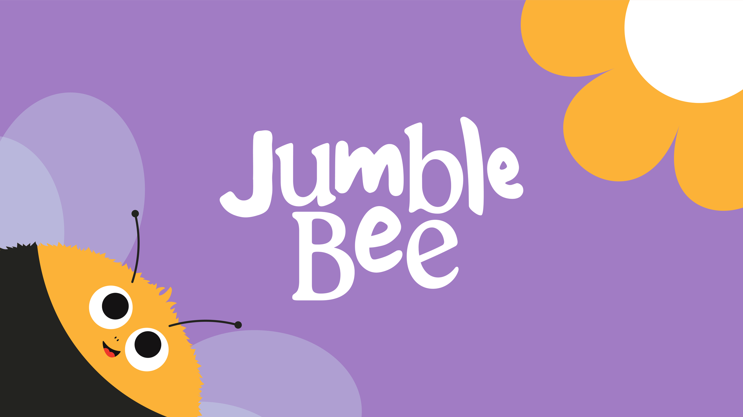
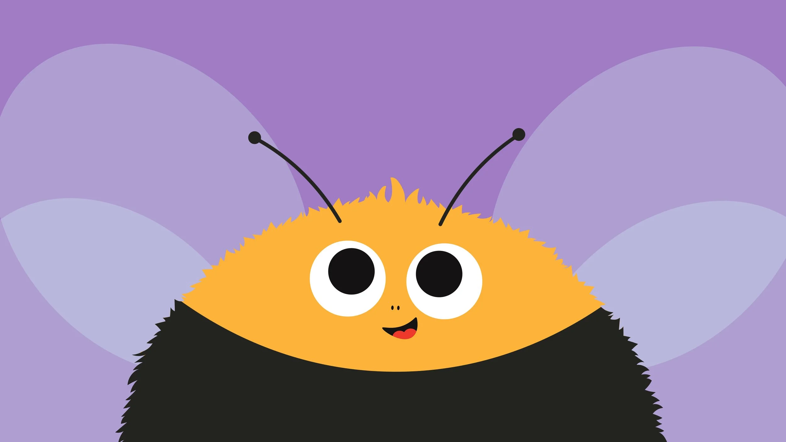
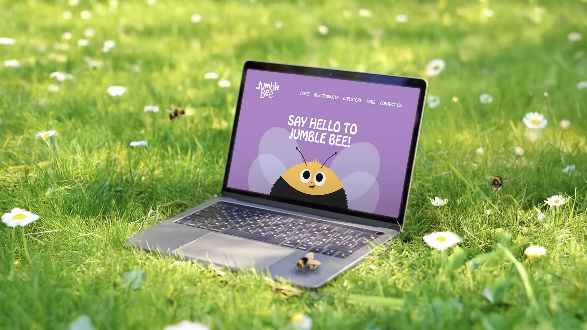
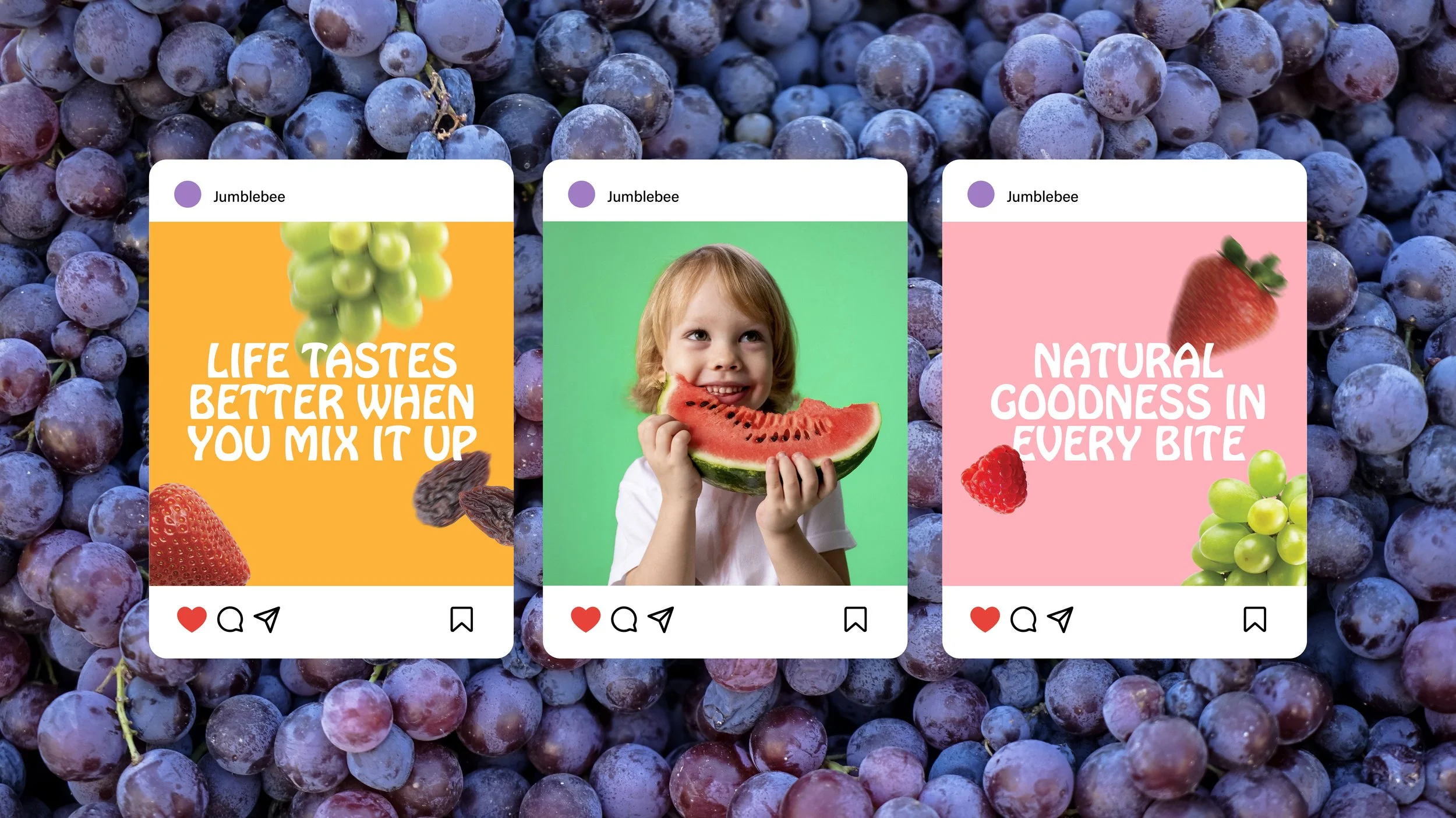
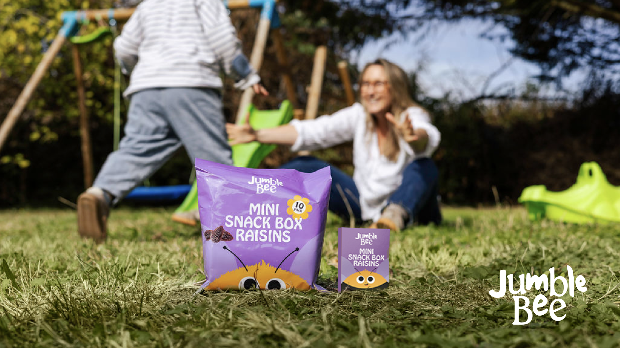
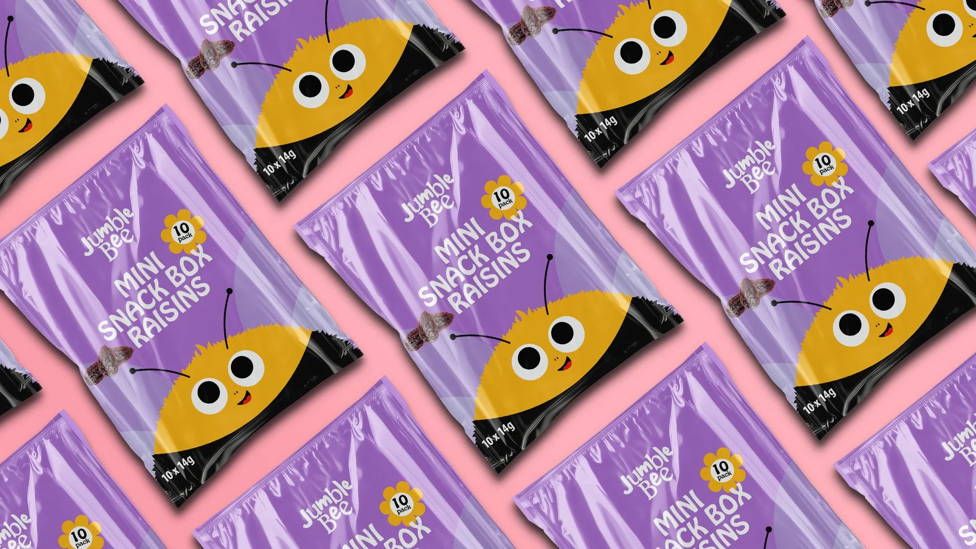
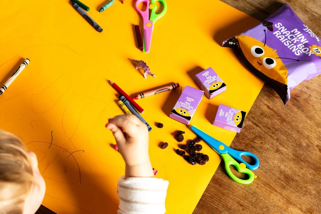
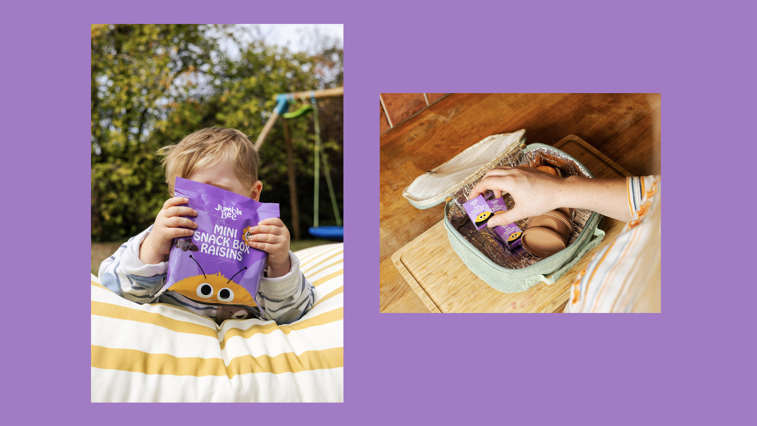
Jumble Bee was a simple children’s dried-fruit brand with history, recognition and potential.
But for years, it had barely been used.
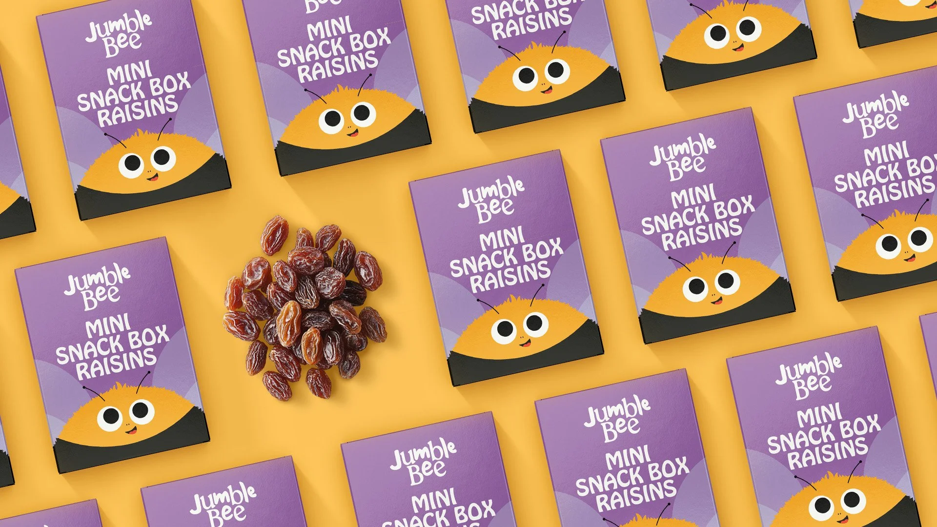
When Community Foods saw an opportunity to bring it back with a new range of high-quality natural raisins, the obvious answer was to refresh the packaging and get it back on shelf.
We thought it deserved more.
Rather than throw everything away and start again, we recognised that even a dormant brand can still carry residual memory, familiarity and internal ownership.
So we looked for the small pieces worth preserving and reimagining – enough to make Jumble Bee feel rediscovered rather than invented from scratch. An original, reimagined.
Research also showed children’s snacking was full of bright, noisy, confectionery-style brands competing for attention. So we went the other way: warm, accessible and fun, but with a more natural, wholesome character that parents could feel good about choosing.
We built the brand around one simple thought: Life tastes better when you mix it up.
A joyful Jumble Bee character, softer visual world and playful tone created a platform that could stretch from packaging into website, social, POS, communications and future NPD.
And the buzz is building.
Jumble Bee has secured a major Ocado listing, unit sales are up 280% year on year, existing retailers are gaining traction and new retailers are showing interest.
Not just a pack refresh. A forgotten brand with its appetite back.